An Introduction to the Power of Colour Photography

We are fortunate today as nature photographers to have the option to tell our stories through color photography.
Color photography was not widely adopted until the 1970s and its diverse effects and scope allow for a much wider range of imagery than photographers of the past could hope for.


Home decor experts, graphic designers, and artists have all made studies out of color, and it should be no different for nature photographers. There are many rabbit holes you can disappear down if you want to learn how to master its power.
Color theory can be as simple as studying the color wheel and learning about complementary and harmonious colors, or it can be as complex as diving deeper into the ways it might influence your compositions or subjects, or indeed into the psychology of colors, and the impact this may have on the viewers of your work.
This tutorial will provide an introduction to color photography and give you some topics to further explore in your studies of this fascinating and incredibly important aspect of your compositions.
How is colour used in photography?
Whatever genre of nature photography you choose to pursue, color is undoubtedly an important element. The way we arrange it in our photographs can be used to express the emotions we hope others will feel when they look at our work.
Indeed, color can determine success or failure in your imagery, as highly contrasting color can just as much distract from your story as tell it.
It can also bring peace and calm or drama and intensity, and it can be used to effectively implement the principles of composition.
Color can bring balance, harmony, emphasis, movement, and variety to your work. Color can also enable compositional guidelines such as leading lines and framing.
Consequently, color is incredibly powerful in its ability to add to your composition if used correctly, as it can take away from it if not thoughtfully considered.

I recently heard an interview with one of the world’s great illustrators, Frank Frezatta, who spoke about how he achieved success in his work.
One of the key takeaways was how he used color to differentiate his front-cover illustrations from others. Instead of using many, in-your-face, contrasting colors, he used a more simple approach: using one or two subdued colors and different tones.
This meant that his covers stood out on store shelves and made his work more intriguing.

If you take the time to analyze different genres of art, it is also clear that a key part of learning about color is understanding how Van Gogh, Picasso, and other master artists use color to create mood, feel, and emotion and to communicate their messages.
They are purposeful in their choices and masterfully use color to achieve their complex storytelling, and we can apply all these things to our photography too.
Understanding color
The simplest place to start your studies is with the color wheel.

This wheel gives us three primary colors, three secondary colors, and six tertiary colors.
Contrasting and complementary colors
Colors that lie opposite one another on the color wheel are called contrasting or complementary colors. When used together, these colors create high levels of contrast and can be used to make your subject stand out on the page.

They can provide impact and convey a sense of drama, intrigue, and unease. For example, a red bird on green grass will immediately draw focus and create a sense of intensity.
This can be a very effective technique to create a focal point but needs to be carefully considered within the context of balance, as a subject with very high contrast may likely need to be balanced by more subdued, pastel colors.
Read more: 7 Ways to Capture Character in Bird Photography
Harmonious colors
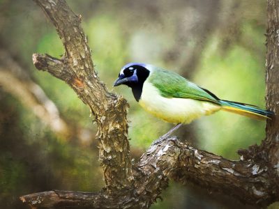
Colors close to each other on the color wheel, such as blue, blue-green, and green, are called harmonious colors. As the name suggests, these colors bring harmony and can be used to convey a sense of peace, order, and calm.
The technique of using simplicity in your color scheme, by using one or two colors and different tones of these same colors, will create a sense of cohesion in your images. This cohesion is called harmony and is a key principle of composition.
For example, consider the image of a Common Waxbill below.
Undoubtedly, using different red and orange hues to connect your subject with its flower-rich grassland habitat can produce a far more emotive image than if we don’t notice or aim for these areas of connectedness.

It may seem simple, but when used intentionally to help you tell the story of the scene in front of you, the color wheel can have very positive implications for your photographs.
Once you start noticing and applying contrasting and harmonious colors in the field, you can then start gravitating towards more complex interplays.
Home decor can be a great guide in this regard, as color schemes for our homes and offices can teach us so much about how to produce emotive outcomes in the field.

Learning about split complementary and triadic color designs and how these are applied in homes, websites, and the like can give us a keen eye for the complexity we can start to see in nature and how to identify whether these could work in our compositions.
I would encourage you to research these topics further beyond this tutorial.
Color psychology
Understanding what colors work with each other and how these can influence how people perceive and react to your images is just the start.
The color wheel can easily lead you into a study of color psychology, defined as the study of different hues as determinants of human behavior.
Although the impact of color on behavior is hotly debated, and empirical evidence is patchy, there is little doubt it has some bearing and, as such, is another interesting aspect to bear in mind.

Colors, like tastes, can influence how people perceive your work as well as the emotions they feel. They can influence mood, how your story is communicated in your photographs, and indeed whether people will buy your work over someone else’s.
In very simple terms, you may use warm colors such as red and orange to convey emotions such as:
- Warmth
- Comfort
- Anger
- Hostility
Cooler colors, such as blue and purple, are more likely to convey emotions such as:
- Peace
- Calmness
- Sadness
- Loneliness
Pablo Picasso was recorded as saying, “Colors, like features, follow the changes of the emotions”. Hence, understanding and appreciating these influences can help us strengthen our compositions and, therefore, our art.

Consider these tonal values and their deeper meanings when playing with the framing of your subject. What moment are you capturing, and how can the use of these colors, found, even subtly, in its natural environment, add to the story?
Color photography in nature
In nature photography, it is worth considering how shooting at certain times of day, in different weather conditions, and at different times of year may influence the colors that will dominate your images.
Blue hour or twilight, especially in winter, will provide you with cooler tones. Rainy or stormy conditions can also usually offer up more in the way of blues, purples, and grays.
Shooting in the sun, of course, will allow for warmer images, with sunrise and sunset (golden hour) allowing for the warmest of tones.
The changing of seasons offers wonderful diversity in color and opportunities alike.
Autumn brings a kaleidoscope of colors with pink, oranges, reds, and yellows often dominating the scene. These warmer colors can influence the atmosphere of your images but also lead to exciting opportunities for contrast and variety.
Summer and spring bring the promise of new life, and often we see our subjects in their best breeding regalia. Their beauty is echoed by their colorful surroundings, making for more high-impact moments with the warmer sun rays adding to these scenes.

Winter, on the other hand, offers softer tonal qualities and allows for more harmonious color in your scenes, as many natural environments may simplify into multiple shades of similar colors.
The weather in winter can also be at its most dramatic, with misty conditions, freezing cold mornings, and snowfall being far more likely.
These conditions add new and exciting colors to your scenes, from blues to contrasting whites and grays. Each season has its own special qualities and, with experimentation, can lead to unique uses of color and indeed, results.
Read more: How to Photograph Wildlife at Golden Hour
Putting color into practice
This may all seem a bit far-fetched, and you may be wondering whether this really has any application for photography.
Unlike designers, decorators, and painters, we don’t get to choose our canvas and plan our drawings from scratch; we don’t get to select our colors ahead of time.
Interestingly enough, although I have had these same doubts about many aspects of composition and design, my own experience suggests that what starts as interesting pieces of information, when combined with practice and perseverance, starts to come to life in our work.
As you learn more about color, you will start to see it come to life in more unique and complex ways in your photographs. This can develop further with confidence or the desire to be more experimental.
You may ultimately find that it becomes a very regular factor in your work, and that you apply it frequently in the field as you find yourself scanning your surroundings for contrasting colors, or shifting the composition through your viewfinder of a species to include more harmonious tones.
In conclusion
Our brains and imaginations have a way of churning knowledge over and over and then helping us to recognize it in our field of expertise or apply it in new and valuable ways.
This is part of the creative process.
To allow it to come to fruition, we need to have knowledge of color, practice applying color in our work, and by doing this, give ourselves the opportunity to recognize a creative moment and implement it in our photography.


