
How to Print Photos: A Photographer’s Guide
Go back two or three decades and you will find a world where photographers created far more prints of their work than the current generation do. Often, they wouldn’t even press the shutter without having a good idea of what darkroom work they planned to carry out and how the final print would appear. Following Ansel Adams’ advice in his classic work The Negative, even exposure decisions would be based on how you envisioned the print.
In contrast, these days vast numbers of images languish on hard drives, never seeing the light of day. Or, at best, they are posted on social media where they may attract attention for a few hours before disappearing from people’s feeds and memories. The impact of this is to make photographs rather fleeting. I’m a bit old-fashioned when it comes to these things – actually, when it comes to many things, to be honest – and I take the view that a photograph doesn’t really exist until it has been printed.


Ironically, the decline in printing coincides with the fact that the printing has become easier and more accessible than ever. You don’t need much space – just a desk with enough room for a computer and an inkjet printer – and the hardware doesn’t have to be as specialist or as expensive as darkroom equipment. Many already have the necessary equipment in place already, being used for other purposes.
Darkroom printing is a much more complicated process: you have to work in a dedicated space in semi-darkness (or complete darkness if you’re making colour prints); it involves noxious chemicals and huge amounts of trial and error. Plus, once you’ve made a decent print there is absolutely no guarantee that you’ll be able to make another the same. Compare that to digital printing, which is done in the comfort of your study, breathing clean air and the results are 100% repeatable.
In this article, we’ll look at how to print a photo properly and how you can achieve the best results.
Choosing the right paper and inks
There are many different types of paper available, including glossy, semi-glosss, matte, fine art/rag, fibre-based baryta, and canvas – all available from various manufacturers.
Paper choice is highly subjective and there is no ‘right or ‘wrong’ paper to choose, but many photographers find they settle on a few favourites. Glossy papers look very ‘photographic’ and are highly reflective with a smooth surface. They have an excellent colour gamut and good contrast range, producing rich, deep blacks.
Because of this, they are perhaps a good starting point for the less experienced printer, as you will probably have fewer adjustments to make at the soft-proofing stage (we’ll come to this later in the article). However, their reflective nature means that if you are planning on framing your work for display, you will have two sets of reflections to contend with.

Matte papers (including fine art textured papers) are often considered better for framed prints, but with a narrower colour gamut and contrast range they can be difficult, especially for the inexperienced printer. They therefore tend to suit monochrome images and those with more subtle colours.
Semi-gloss papers could be considered a reasonable compromise between the two. They have similar colour gamut and contrast range to glossy papers, but are not as reflective. Fibre-based papers often have excellent characteristics when it comes to printing: a wide colour gamut, excellent contrast, and very low reflectivity – but they are expensive. Save these papers for your favourite prints.
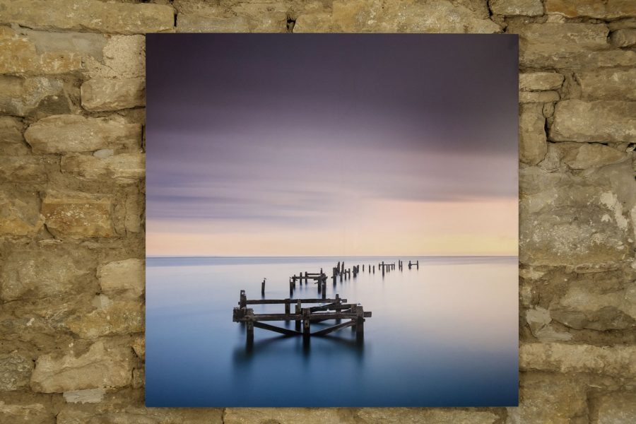
Canvas – especially the unframed ‘gallery wrap’ – used to be an extremely popular way of displaying prints, but seems to have had its heyday. However, its heavily textured surface can hide a multitude of sins, so if you have an image that needs to be enlarged beyond what you think will look good, canvas can be worth a try.

When it comes to ink, there is far less choice. Essentially there are two types: dye and pigment. It used to be the case that the choice was between vibrancy (dye) and longevity (pigment), but the vibrancy of pigment inks has increased enormously in recent years and nearly all good photo printers now use pigment inks.
So the only real choice is between the printer manufacturers’ inks and third-party inks. The latter can save you money, especially if you buy a bulk ink system from manufacturers such as Fotospeed, but be warned that using these inks can invalidate the printer’s warranty.
DPI vs PPI
When it comes to image resolution and print resolution, there are two terms which seem to cause no end of confusion: Dots Per Inch (DPI) and Pixels Per Inch (PPI).
DPI refers to the resolution of the printer and, generally speaking, the higher the better as you will get better tonal transitions in the print. If the DPI is too low, then you will be able to see the dots – like with newspaper print.
PPI affects the dimensions of the image. The lower the PPI, the bigger the image. For example, an image which measures 5400 by 3600 pixels has a physical size of 18 by 12 inches at a resolution of 300 PPI. At 200 PPI, it will be 27 by 18 inches.
The resolution of the image will also have an effect on print quality, because if there are too few pixels per inch, individual pixels can be seen in the image and results in jagged edges and ‘pixelation’.
Ideally, the number of pixels per inch will be matched to the native resolution of your printer (see Step 5 of the soft proofing guide later on in this article). So, to print at the required size you may need to ‘interpolate’ the image. Many printing apps, including Lightroom, do this automatically.

How to get prints to look like the photo on screen
Many photographers get put off by the idea of printing their own photos after just a few attempts, perhaps because they see prints coming out of their printer which are far from being a match to what they see on screen.
But these are all small hurdles that can be overcome, and there are three crucial steps in the process to achieving a good screen to print match.
1. Screen calibration
The first is screen calibration. This is a relatively simple process, done with a hardware colorimeter such as the Datacolor Spyder or X-Rite i1Display. Results will depend on the quality of your monitor and how much control you have over setting the white point, contrast, and brightness – but reasonable results are achievable even with fairly basic monitors. The process can be as straightforward as simply following the software’s wizard and using the suggested defaults. Once done, your monitor should be displaying colours which match an agreed standard, and your image should look pretty much the same on any other correctly calibrated monitor.
2. Printer profiles
Of course, having a monitor that displays accurate colour does not guarantee that your printer will also output accurate colour. To ensure this, you need to obtain profiles for your printer so that it also produces colour which matches an agreed standard. You can get custom profiles made, specific to your printer and its inks and the paper you print on, or you can use the generic profiles which many paper manufacturers make available for free. In my experience, these are usually very accurate and they come with clear instructions on how to load them onto your computer.
3. Soft proofing
Having gone to the effort of calibrating the screen and profiling the printer, many photographers are understandably disappointed when they discover that they still can’t get prints which match the image on screen. Many wrongly assume that there is an issue with their profiles and waste a lot of time trying to ‘correct’ this issue.
There’s a fairly simple explanation for why prints may still not match what you see on screen. The colour gamut of modern monitors far exceeds what printers are capable of producing on paper. Furthermore, the range of contrast which can be displayed on screen is also far greater than that which can be produced on paper, though this varies from paper to paper. The printer driver works by ‘translating’ what is shown on screen to what can be reproduced with ink on paper. And sometimes, things get a little lost in translation.
This brings us to the third part of the puzzle when it comes to producing accurate prints: soft proofing. This is a feature available in all good printing applications such as Photoshop and Lightroom and it allows you to create an onscreen preview of how your prints will appear on your chosen paper. You can then tweak the proof until it matches the original as closely as possible before you print it.
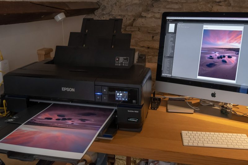
Soft proofing: How to accurately print a photo
The following step by step tutorial takes you through the soft proofing process to outputting a print. I’ve used Adobe Lightroom, but the process will be similar in any other good printing programme.
I’ve also chosen a matte paper for this demonstration, as they are generally more difficult to print on due to their more limited colour gamut and range of contrast and therefore require more adjustment at the soft proofing stage.
Step 1
Open your selected image in the Develop module and click the ‘Soft Proofing’ button under the image. Then click the Before/After view so that you can compare the proof with the original image.

Step 2
Click the symbol at the top right of the histogram to activate the Gamut warning, which will highlight out-of-gamut colours in red.

Click ‘Create Proof Copy’ under the histogram, so that any changes you make are to a virtual (proof) copy. This is also the image you will print from.
Check the ‘Simulate Paper & Ink’ box; this simulates the white tone of the paper you’re using and the black density of your ink.
Step 3
You now need to choose the correct paper profile. I’ve chosen a matte paper for this tutorial. The next step is to choose a rendering intent (underneath ‘profile’). Think of rendering intents as the way the printer driver translates colours from screen to paper. You have a choice of two: Perceptual and Relative Colorimetric (labelled ‘Relative’ in Lightroom).

With Perceptual selected, all the colours in the image are shifted in an attempt to preserve detail in the out-of-gamut areas; with Relative Colorimetric, it simply clips the out of gamut colours.
There are no rules for which will work best – you simply have to try the different intents on an image-by-image basis. In this instance, Relative gives a slightly better initial result.
Step 4
You can see that there has been a colour shift towards magenta in the proof, and the proof has become slightly darker and lacking in contrast compared to the original. To match the proof to the original, I’ve made adjustments in the Tone panel to Exposure, Contrast, Highlights, Shadows, Blacks and Clarity.

In White Balance, I’ve used the Colour slider to slightly warm the image and I’ve removed magenta using the Tint slider. I’ve tweaked the reds and oranges in Hue, Saturation, Luminance to match the cloud colours to the original. This has resulted in some out-of-gamut colours, so I’ve also reduced the saturation in the reds. Where the sky had lost a little punch, I used a graduated filter to increase contrast. The result isn’t a 100% match to the original – this isn’t always possible – but it’s very close and certainly much closer than the uncorrected proof.

Step 5
Now it’s time to print. Open up the proof copy in the print module. Use Page Setup on the bottom left of the screen to select your paper size and Print Settings to select paper type and print quality (e.g. 1440dpi).
At the top of the right-hand panel, select Single Image. The size and aspect ratio of the image is determined by the Cell Size you choose, and whether you select Zoom to Fill or Zoom to Fit.

At the bottom of the panel, you’ll find the Print Job panel, where you have to make some important selections. In Color Management, check that you have the same profile and rendering intent selected as for the proof image.
Set the print resolution. This is a much debated topic, so I’ll keep it simple: set a resolution which matches or divides neatly into the native resolution of the printer. For example, Epson printers have a native resolution of 720 pixels per inch, so a print resolution of 360ppi works well.
And that’s it. Check that you’ve got the right paper loaded and hit ‘Print’.
In conclusion
Hopefully, this hasn’t put you off the idea of making prints – it really is a much simpler process than many would have you believe. With good profiling, once you’ve got the hang of soft proofing, you should be able to get a good screen to print match every time.
Go ahead and make some prints of your favourite images. Frame them and put them up on the wall; maybe even organise an exhibition. You’ll find it gives you a lot more satisfaction than posting on social media.