All You Need to Know to Process a Raw File in Lightroom
If you’re new to processing a raw file, or you don’t particularly know what you’re doing, then this tutorial is for you. I’ll run through everything you need to know when processing your image. The mystery behind all those sliders will be a mystery no more!
If you haven’t yet made the switch from JPEG to raw, then make sure to read “Why You Should Be Shooting in Raw” too!


First we’ll start by looking at the different elements to Lightroom, and what all those different sliders can do and when you should utilise them. Then I’ll take you through a typical workflow and how to process an image. If you want to navigate between different parts of the tutorial, you can select from the menu below:
Navigation: Importing | Develop Module | Treatment | Tone | Exposure | Contrast | Highlights, Shadows, Whites & Blacks | Presence | Vibrance & Saturation | Lens Corrections | Cropping & Composition | White Balance | Tone Adjustments
Importing
On opening Lightroom, you’ll need to import your raw file so you can process it. To do this, click on “Import…” at the bottom left of the screen.

When the import box comes up, navigate to where the file is on your computer using the directory browser on the left. Thumbnails will be displayed in the main window – make sure they are ticked at the top left of the images. It should be already if it is a new image to your library. Then, click the “Import…” button.

So, now your image has been imported into the Library shown on the left. It’s important to tag it before proceeding. Not everyone needs to do this, but as I upload images to image libraries, magazines and agencies, it saves time doing it now as it helps when searching for images later. Information like location, species name, common and latin names, season, country you can all add, and there’s no limit to how many tags you can make. Once that’s done, click the “Develop” tab at the top.

Develop Module
This is your main area to tinker with your images. On the right is an array of sliders to fiddle with to your heart’s content. Remember, you can go nuts with some of these settings so it’s always mindful to keep your images true to life and make subtle adjustments to only enhance your images without going over the top!

Let’s take a closer look at these sliders!
Treatment
This is where to find your White Balance (WB) settings. As you can see, it currently says “As Shot” – this is the WB which was set at the time of shooting, which was Auto WB on my camera. As this is a raw file, it doesn’t really matter what WB was set when taking the photo. We can change the White Balance to a completely different setting if we wanted to. If we had shot the image as JPEG however, this would not be possible as JPEG files do not hold as much data in them to make such changes. You can also tell Lightroom what the correct WB is by using the Selector Tool pipette. I’ll cover this later.
Tone
Here you have control of Exposure, Contrast, Highlights, Shadows, and Whites & Blacks. Using the “Auto” button here can sometimes work, but if you care about making your images just right, then you’ll want to tweak these sliders too.
Exposure
This setting basically allows you to adjust the original exposure. The extent of the adjustments depend mainly on the dynamic range of your camera and how much information (highlights and shadows) it captured when you pressed the shutter. It won’t help you to recover a huge amount of a blown out scene or super under-exposed subjects, but it will allow you some adjustment to make the image even and correct. After using this, you’ll realise that you can shoot to capture details in the highlights of your subject (white parts) and lift the shadows (within reason) later on, making for a much more balanced exposure.
Contrast
Adding a positive value will make the shadows and highlights more apparent, and a negative value will make the overall scene more ‘flat’. The “Tone Curve” panel is a lot better at controlling contrast value, but slightly more complicated to master.
Highlights, Shadows, Whites & Blacks
These are the best tools to give your scenes that wow-factor. Used in moderation, these will allow you to adjust individual parts of the histogram to produce a more rounded exposure. Highlights are just that; sliding it to a negative value will recover a lot of highlights that have been overexposed. Remember, unless the data & details were captured on the raw itself in the first instance, they won’t be there to recover, however much you slide it! Shadows are the same too; you can lift the shadows back into life, but again be careful not to make things look unnatural. Whites & Blacks adjustments change how white the whites are, and likewise how black the blacks are. Be careful with these two, as you can end up very a very harsh looking contrasted image if used too much. There are no set in stone values for any of these, apart from using them all with care. Remain true to life and only boost what needs to be boosted.
Further Reading: How to Rescue Over and Underexposed Photos
Presence
Clarity affects the definition between light and dark edges. Sliding this to a positive value can really boost the impact of you images by effectively making everything sharper, textures more detailed and making objects more defined to the viewer. However, as this is applied across the whole image it can also enhance the appearance of something that you maybe don’t want the viewer to see; like an out of focus background object for instance, so again use it with care. For more localised control you can use this on an adjustment brush, which I’ll go over in another tutorial. Putting a negative value on the Clarity slider can give a soft focus effect, which is good if that’s what you’re after. Either way, this isn’t a slider to use in high values on everyday images, as it will make them look fake and overdone.
Vibrance & Saturation
If you want to boost your colours, Vibrance is the one to adjust. This will boost the parts (separate colour channels) of the image that need it, and not give you any random colour casts. Moving it to the left will make colours less intense, but the photo won’t go completely black and white. Saturation is more of an overall change which will affect the whole scene; a good one to use to desaturate your image for a black and white look.
If you’re looking for more specific colour adjustments, then read Lightroom Colour Correction: Hue, Saturation, and Luminance.
Making Your Edits
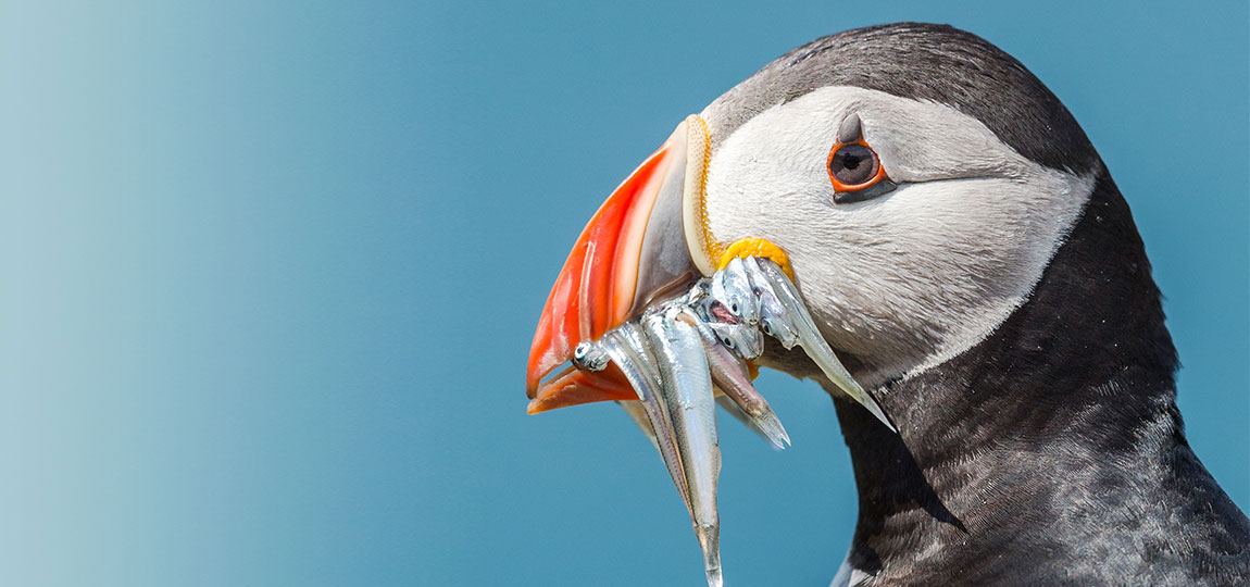
Now let’s look at what you should actually do with your imported photo into Lightroom. Taking our trusty puffin photo as an example, this is how I would go about processing the raw file in Lightroom.
Lens Corrections
One thing I always do is tick “Enable Profile Corrections” and “Remove Chromatic Aberration”. I have in fact got these two items set up to automatically apply themselves on import of an image.

The Profile correction will be specific to the lens you took the image with, so if it doesn’t load automatically, choose your camera make then the lens you took it with. This counteracts the barrel distortion and any vignetting that occurred when taking the image. So, you’ll see that horizon straighten up (to a certain extent) and also the corners brighten. These are side effects of some lenses, especially wide angles. Of course, if you prefer the look of these before the corrections were applied feel free to adjust them to your own liking.

Cropping & Composition
Cropping is usually the first thing I’ll do to an image to see if it works before spending anymore time perfecting it. Clicking the crop button or pressing R on both Windows or Mac will bring up the crop adjustments. To preserve the original 3×2 aspect ratio, make sure the padlock is closed shut by clicking it. Then, grab one of the anchors to crop the image. As you can see it comes with preset “3rd” dividers to aid composition.

As this image was fired off quickly, there wasn’t much time to think about composition at the time, and as such you can see part of the bird is missing. As the main draw to this shot for me is the mouthful of fish, I’ll emphasise that with a tighter crop to help the viewer to see all the details in the fish and the puffin’s face.

Again, if you read up on composition tips you would have come across positioning your subjects (especially wildlife) on a vertical third, leaving space for the subject to look into.
White Balance
On every shot, I always manually set the white balance. If you’ve worked on a lot of digital artwork over the years, you’ll know that dialling in the same number in all three Red, Green & Blue (RGB) channels will give you a shade of grey between white and black. My thinking is that as the correct white balance will be calculated off something neutral in the scene, what’s a better way than choosing something grey with no colour information! Neutral in my eyes is between 50-60% grey.
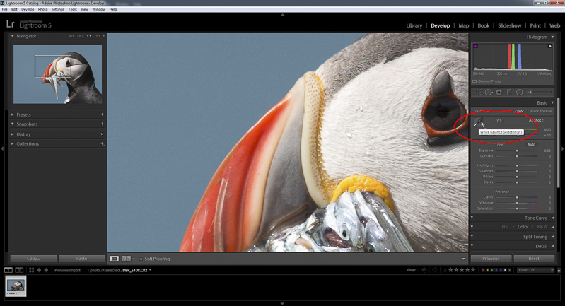
Click on the White Balance Selector tool and find something in the scene that will roughly be of a neutral reading. The top of the Puffins beak is perfect for this, giving me a rough reading across all three values of around 60%. This will adjust the Temperature and Tint to suit where you’ve clicked. Obviously, again, feel free to makes adjustments on either value to give it the look you’re after.

Tone Adjustments
So, with the correct White Balance applied, the next step is to make the image pop! For this image, I have done this by:
Lifting the overall exposure by two stops; boosting contrast of the image; dropping the Highlights, reducing blown parts on the white feathers to recover details; lifting shadows in the darker feathers and eye (not too much!).

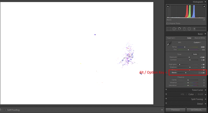
This is the magic button! You can use this on most of the other values, but by holding down the Alt/Option button and clicking the White or Black slider tools, you’ll bring up this view which shows you a mask of where each channel is being clipped. By clipped, I mean it’s showing you where parts of the image are starting to lose information. On Whites it shows what is completely clipped (blown-out) in white and the individual colours clipped in colour. Black means not clipped, so information is still present. Likewise with Blacks, white parts will show where there’s still information and black shows the clipped parts. Don’t go too mad with these as whilst they will deliver more of a contrasty/punchy look; you can also ruin an image if you go too far with both.

Clarity is good for creating visibly sharper images by increasing the contrast between light and dark edges – perfect for feather details. Remember, this is applied across the whole image, so here it’s fine as we’ve got a clean background, meaning nothing else is being enhanced other than the subject.
Now, vibrance. raw images have no picture styles applied to them, like out of camera JPEGs do, so are always captured on a neutral colour scheme and as such, they always need a little boost. Use the Vibrance slider to increase the colours.
That’s pretty much it for a basic process of a raw image. As Lightroom is a non-destructive processor, you can always come back and change settings if you’re not happy and, at worst, return to the start again.
The best way to see your work is to press the Y key to see a before and after, then use the button at the bottom left to cycle through the viewing options.

Now, all you need to do now is export it to a format of your choice. JPEG is the most common, especially for using on your website etc. Go to “File > Export“.

Choose “Export To Same Folder as Original Photo”. That way, if you’re good at organising your images, the processed version will always be with the raw file. Choose the option to put it in a subfolder, and name it to your liking – “Processed” works for me. File settings can be what you want, but I do JPEG, sRGB colour space (better for web) and 100% Quality and hit Export!
The following articles may be of use here: