
The Post-processing Mistakes You Don’t Want to Make
Whether you’re using the latest version of Adobe Photoshop or an ancient copy of Lightroom, post-processing mistakes can be all too easy to make. You could take an incredible photograph, but if you run it through editing software badly it could be ruined in a matter of minutes. Here are some of the most common post-processing mistakes that you want to avoid.
1. Cropping Tightly
Cropping is probably the first thing everyone learns to do in their editing software. It’s used every day by photographers all over the world, but for such a simple tool it can have a very negative effect if used badly. The biggest culprit here is cropping too tightly and not leaving enough room for the subject to ‘breathe’ within the frame.
The photo on the left in the image below is properly cropped. There is sufficient space around the capuchin monkey and it doesn’t look constricted. The crop to the right of it shows a version that is too tightly cropped. Whilst nothing is ‘cut off’ by the edge of the frame, it looks rather cramped. Cropping too tightly is a trap you can fall into if you’re looking to fill the frame with your subject. Make sure you give your subject some space around the edges!

Sometimes you do want to crop in and highlight certain features of an animal. Usually, a crop of this sort would be on the face. The key thing here is that if you’re going to start ‘chopping off limbs’, don’t do half the job – it’s all or nothing when it comes to digital amputation!

It’s also worth noting that sometimes you can crop too much. If your subject is too far away in the first place, making huge crops to rectify this will leave you with a very small file size. It also exacerbates any imperfections in your shot, such as digital noise or soft focus.
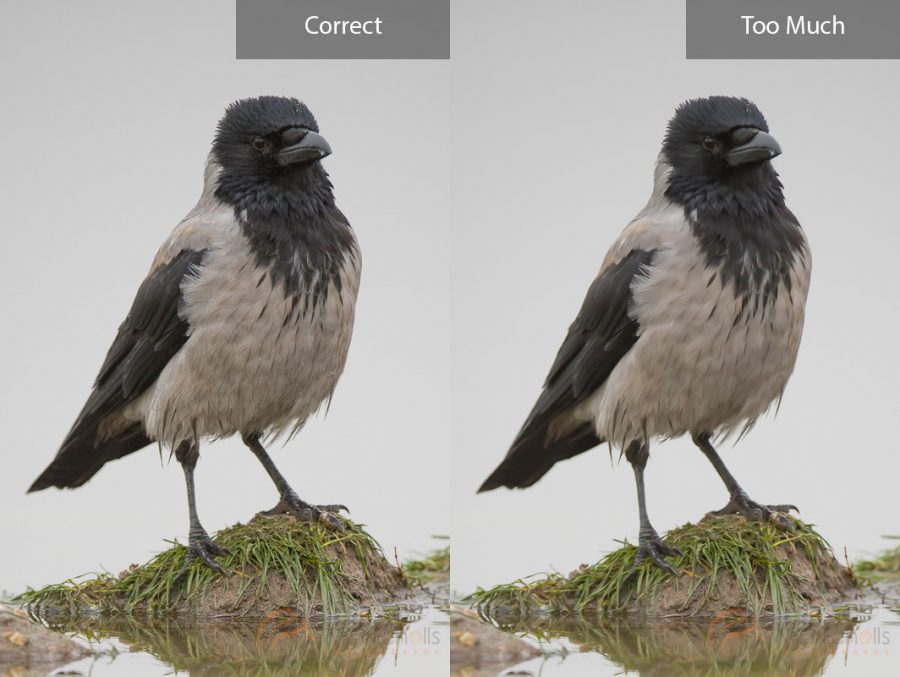
2. Too Much Sharpening
This is another big killer of photos. We all want to get the sharpest photos possible, and the sharpening tool definitely has it’s place when editing your photos. However, the sharpening slider can tempt you to go too far, and the results are something that are easily noticed.

You can see in the above example that the over sharpened photo looks almost fake. All of the edges of the hairs become far too crisp. In fact, it also introduces noise into the photo – something you want to avoid. Keep it simple and don’t take the sharpening slider higher than around 60.
Further Reading: “How to Sharpen Images in Lightroom“
3. Too Much Noise Reduction
Just like sharpening, you can overdo it with noise reduction too. It almost gives your photos a waxy texture, removing all detail and flattening edges that make something appear sharp. The comparison below clearly shows what noise reduction can do to a photo.

Noise reduction is usually only applied to the background, so make sure you have sufficiently masked your photo to stop the adjustments being made to your subject. Noise is often less visible in the subject of your photo where there is detail. Instead, it is more evident in the smooth and darker areas of a photo.
Further Reading: “How to Reduce Noise in Lightroom“
4. Too Much Saturation
Saturation is a big killer of photos. It can make colours appear very ‘hot’ in your photo, whilst also making images cease to appear natural. Take a look at this photo of a white-tailed eagle:

The colours look natural, there’s nothing unbelievable about it. All I’ve done here, with regards to colour, is boost the vibrance slider a little. Vibrance is your friend – you should go to this slider first if you want to improve the colour of your photos, rather than saturating it. You can think of the saturation slider as pouring vivid paint all over your photo in an attempt to revive it. Whereas the vibrance slider boosts the colour that is already there more subtly.
Here is what happens when you pull the saturation slider up a little too far:

That slider still has a long way to go, too. The saturation slider produces ugly results and is not very subtle about the way it does things. Stick to the vibrance slider, and make sure you keep your photos looking natural.